

Source : Live Starlink Satellite Map
Source : Live Starlink Satellite Map

Répartition géographique des soutiens pour la proposition de loi référendaire sur la privatisation des aérodromes de Paris (ADP)
Source : Carte des soutiens (adprip.fr/)
Version actuelle, avec 2 milliards d’utilisateurs, posté le 27 juin par Mark Zuckerberg :

et version de Paul Butler de décembre 2010 avec 500 millions d’utilisateurs :

Sans commentaire…
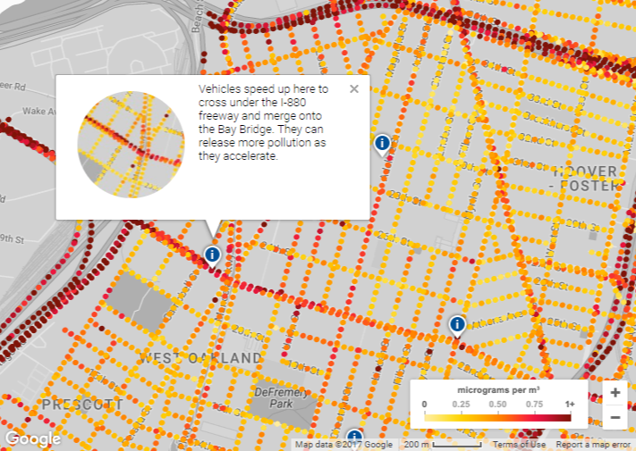
« Today, with our partners at Environmental Defense Fund (EDF) and Aclima, we’re sharing the first results of an endeavor we started in 2015: to measure air quality using Aclima equipment mounted on Google Street View cars. You can now see maps for Oakland, CA, released by EDF, of nitric oxide (NO), nitrogen dioxide (NO2) and black carbon—pollutants emitted from cars, trucks and other sources that can affect our health and our climate ».
Source : Let’s clear the air: mapping our environment for our health

Source : Cartes interactives | Arcep

« Malin comme l’est l’urbain de ce siècle, nous nous tournons alors vers nos smartphones qui nous ouvrent avec étonnement les portes de tous les clubs de la ville, de toutes les herbes, de toutes les graines et de tous les joints ».

Source : Weedmaps : nous avons testé le Yelp du cannabis à Barcelone – Pop culture – Numerama

Research published in PLOS One offers a quantitative approach. Using a combination of math and maps, Garrett Dash Nelson, a postdoctoral student in geography at Dartmouth College, and Alasdair Rae, an urban data analyst at the University of Sheffield, solidify the concept of the “megaregion” as an interlocking, yet self-contained, economic zone. They use millions of point-to-point daily commutes—perhaps the best proxy for economic geography there is—to outline at least 35 urban cluster-oids around the U.S. What gets revealed, according to the paper, are a “set of overlapping, interconnected cogs which, working together, constitute the functional economy of the nation.”
Source : U.S. ‘Megaregions’ Revealed Via Commuting Data – CityLab
The Upshot, FiveThirtyEight, Predictwise, etc: their predictions for President varied over the campaign as you’d expect as new data came in, but consistently made Clinton a solid favorite, with a probability of a win topping 70% the day before election day. So what went wrong?
Today we’re launching extrusions for Mapbox GL JS!
Source : 3D features in Mapbox GL JS | Mapbox

Mapping historical photos from the NYPL
Source : OldNYC: Mapping Historical Photographs of New York City
© 2026 no-Flux
Theme by Anders Noren — Up ↑